Making the big — and little — of science visible
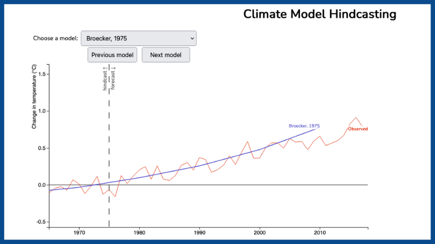
In 1975, Wally Broecker’s model — one of eight included in a new hindcasting interactive — predicted that the CO2 effect would overwhelm Earth’s natural climate cycles.
Science involves phenomena both unimaginably large and unbelievably small. Yet teachers are tasked with helping students understand such objects and processes. How can they get their students to wrap their minds around these often hard-to-fathom concepts?
One answer, according to The King’s Centre for Visualization in Science (KCVS), is to give them — teachers and students alike — interactive digital tools that make some of the abstractions of science more concrete.
“Humans on average are very visually oriented,” explains Rob MacDonald of KCVS, a research center of The King’s University, Edmonton, Alberta, Canada. “We tend to think visually. It’s right in our language — ‘Do you see what I’m talking about?’ — these sorts of things. So having information presented in a visual way often makes it easier to absorb and easier to make sense of and engage with.”
As examples, MacDonald points to specific KCVS tools: “There are a lot of simulations of chemistry ideas, like molecular fractions, that are too small to see. There are quantum mechanics visualizations.” On the other hand, he adds, “There are astronomy applets — the scale of astronomy is too large to work with directly. And, of course, climate change. Earth is a huge and complex system that’s difficult to directly connect with.”
David Amidon, an NCSE teacher ambassador who teaches middle school science in Lafayette, NY, definitely understands the challenges of teaching complex systems to eighth-graders. In fact, it was his work with NCSE that inspired us to partner with KCVS. So far the center has developed two applets in collaboration with Amidon and NCSE Director of Teacher Support Lin Andrews. The first, released in 2020, is called Climate Contributions and depicts many of the different possible reasons why the global temperature is rising. The interactive graph allows a student — or anyone, for that matter — to see how much warming might be attributable to particular factors, such as volcanic activity and fluctuations in solar radiation.
“A lot of people have said, ‘Well, [volcanic activity and solar radiation] contribute to the changes in our climate.’ So the idea with this applet is to try to show they do affect the climate. But they don’t come anywhere close to creating the large increase in temperature that we actually see until you incorporate things in the simulation like greenhouse gases — the human contributions to the climate,” MacDonald says. “The simulation demonstrates that we really do know with a great deal of confidence that humans are causing the change in climate.”
The second applet, called Climate Model Hindcasting, which was released just as school was starting across the country in late August 2021, looks at the accuracy of climate models. And, no surprise, those models turn out to have been very accurate in predicting the warming experienced over the past 50 years. Students are able to test out these models by altering parameters to see for themselves what might make a model more or less accurate. The applet also helps students see how the models became more accurate over time — what parameters were added to increase reliability. In addition, students can access information to help them understand what’s meant by “accurate” in models, why some short-term fluctuations are ignored, how to know which fluctuations to ignore, and other aspects of climate modeling that might otherwise be hidden to them.
With both simulations, the visualizations not only provide students with a more concrete understanding of climate science, they also address two important misconceptions — “Climate change has always been happening” and “You can’t trust models” — that NCSE’s climate lesson plans are specifically aimed to help students overcome.
“By using visualization tools like those generated by KCVS, teachers are able to put real climatological evidence into the hands of their students,” explains Lin Andrews, NCSE’s Director of Teacher Support. “These tools condense large amounts of data and provide strong visual support for understanding previously hard-to-grasp concepts — all with the click of a button. This is what gives these manipulatives such power in the classroom.”
If we make changes—and these are all realistic changes — we can solve this problem. It’s addressing the misconception in a very positive way.
KCVS works with local, national, and international partners to develop the many dozens of visualizations at its website. Co-founded in 2005 by current director and chemist Peter Mahaffy and astrophysicist Brian Martin, its goal has always been to help students better “see” science. Mac- Donald says, “I basically stuck my nose in and took a look around to see where I could help” several years ago once he learned what the center was up to. Since then, he’s been working with KCVS to provide technical support overall and as design lead on specific projects such as the NCSE visualizations.
“I’m very interested in visualization in general,” explains MacDonald, who along with his work at KCVS also teaches physics, statistics, computing science, and mathematics at The King’s University. But dealing with climate change misconceptions is of particular interest. “It’s one of the things that comes up a lot when I’m teaching — addressing misconceptions and trying to help people to see that this idea that they had that’s actually often interfering with their further learning is wrong or oversimplified.”
One of the simulations MacDonald is most proud of working on is Design Our Climate, which is incorporated in KCVS’s Climate Solutions resource. Design Our Climate lets you make decisions about the planet’s future climate, addressing the misconception that there’s no hope and therefore no point in doing anything about climate change. By manipulating various interventions in the simulation, you realize that it is in fact possible to have a significant impact, though it will take many interventions rather than any single one to reach a comprehensive, lasting solution. The simulation shows that “if we make changes — and these are all realistic changes — we can solve this problem. It’s addressing the misconception in a very positive way,” MacDonald says. This KCVS visualization tool is also included in another of the NCSE lesson sets, the soon-to-be-published Climate Super Solutions.
MacDonald is quick to share the credit with the many people whose efforts are involved in creating the KCVS simulations. The Climate Solutions website development, in particular, was an all-hands-on-deck moment for KCVS. MacDonald is especially appreciative of the work of the university’s undergraduates, who do everything from revisiting different tools ensuring that they incorporate the latest data to coding to engaging with the primary scientific literature. “We’ve consistently had really good students, and they’ve really made KCVS and its resources what they are,” MacDonald says.
KCVS works with local Canadian school districts, organizations like NCSE, and groups like the Climate Literacy and Energy Awareness Network to ensure that its visualizations get into the hands, or rather onto the screens, of students all over North America. Thousands of visitors each month flock to the KCVS site. Soon they will include the students of all the teachers who use NCSE’s resources.
This version might differ slightly from the print publication.